GeoPlanner is a multiple scenario planning and design tool. GeoPlanner also has tools to help you compare scenarios so you, your team and your stakeholders can make informed and evidence-based decisions. It has reports that help you inventory the types of natural assets in an area and catalog how the features in your plan summarize models and assessment layers.
KPI Report
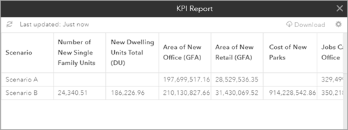
The KPI Report displays Key Performance Indicator (KPI) values for one or more scenarios. This allows you to compare KPI values across many scenarios. This report gives you a project level view of performance. You can also download the report as a .csv file.
The following steps detail how to create a KPI Report. Before you follow these steps, make sure you have one or more KPIs. If you created a project from the Basic, Economic Development Planning or Green Infrastructure Planning templates, you already have KPIs in your project. If you did not, review this topic to learn how to create a KPI.
- On the application toolbar, click Evaluate.
- Click the Report drop-down and select KPI Report.
- In the Select Scenarios dialog box, check on the scenarios you want to include in the report. Click GET REPORT.

- To download the KPI Report, click the Export as .csv icon in the upper right corner of the KPI Report.
- To generate a new KPI Report with different scenarios, click the Settings icon to access the Select Scenarios dialog box.
Chart Report
GeoPlanner's Chart Report is similar to the KPI Report in that it shows a summary of dashboard elements from one or more scenarios. However, it reports only on the chart elements in your project. This report displays the distribution of types in a dashboard chart and how each type summarizes a model or assessment layer. Types correspond to the left side chart and models or assessment layers to the right side chart. You can also report on how each individual feature summarizes a model. This gives you potential suitability scores per feature. The following table illustrates the output from this report when reporting by feature type:
| Scenario | Chart | Evaluation Layer | Score Type | Value | Units | Score Percent | Evaluation Layer | Score Type | Score Percent |
|---|---|---|---|---|---|---|---|---|---|
Scenario B | Design | Basislaag | Openbaargroen | 28.494 | Hectares | 27 | Proximity | 5 Medium | 43 |
Scenario B | Design | Basislaag | 6 Medium+ | 57 | |||||
Scenario B | Design | Basislaag | Privaat | 79.389 | Hectares | 73 | 5 Medium | 47 | |
Scenario B | Design | Basislaag | 3 Low+ | 53 |
Use this report to understand impact of all types or all features against a model or assessment layer. This report will help you understand suitability scores for each type or each feature within a type. Use the following procedures to generate a Chart Report:
- In GeoPlanner, create a suitability model using the Modeler or the classify tool.
- Click the Dashboard button in the map tools on the left side of the map. Configure the left side chart to report on your scenario features. Configure the right side chart to report on the model you created in step 1.
- Click the Evaluate segment. Then click Report and choose Chart Report from the dropdown menu.
- Click the Scenario dropdown and choose the scenario you want to report on.
- Click the Chart dropdown and choose the chart that you want to generate a report against.
- Click the Collect statistics dropdown and choose one of the following:
- Per type—Summarizes model scores by feature type. For example, Per type will report model scores on total Low Density Residential, Medium Density Residential and High Density Residential types.
- Per feature—Summarizes model scores by individual feature. For example, Per feature will report scores on each Low, Medium and High feature.
- Click Run.